Last modified: 2005-01-22 by antonio martins
Keywords: neuquén | error | volcano | lanin | pehuen | araucaria araucana | tree: monkey puzzle | poincieta | estrella federal | flower: federal star | star: 8 points (red) | stars: 17 | stars: arc | star: 5 points (golden) |
Links: FOTW homepage |
search |
disclaimer and copyright |
write us |
mirrors
![[flag of Neuquen]](../images/a/ar-neu.gif)
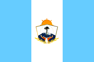
Neuquen has three equal vertical stripes blue, white, blue. In the center,
a badge made from elements of the provincial emblem (the
same person designed
both flag and emblem). On the flag it consists of a blue disc charged with
the volcano Lanin, and a pehuen (monkey puzzle tree, Araucaria
araucana) infront of it. Around the disc, laurel branches on the joining
of which a poincieta, or federal star (estrella federal), a
local flower.
Gustavo Tracchia, 23 Feb 2000
![[flag of Neuquen]](../images/a/ar-neu!b.gif)
![[flag of Neuquen]](../images/a/ar-neu_o.gif)
Ornato flag is a flag for decorative purposes.
Jaume Ollé, 31 Aug 2000
![[flag of Neuquen]](../images/a/ar-neu!o.gif)

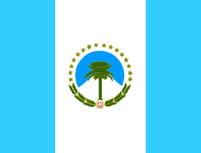
This image is not correct. The Neuquen’s flag is certainly blue -
white - blue vertical, but the central emblem is not the arms of the
province, depicted in this image, but a stylized version in green and
gold, including 16 golden stars in semi-circle. Also proportions should
be c. 4:5 instead of the used 2:3.
Mario Fabretto and
Jaume Ollé, 10 Dec 1998

At the official website there is a
flash
presentation including the flag.
Dov Gutterman, 13 Dec 2001
The image at the provincial website, coming from the province government,
should be best, though it is not. Neither technically, but is also
shows design differences comparing with Jaume’s image above
— the width of the blue stripes, it’s shade respective to
the national flag and to the sky on the emblem, and
design details of the emblem itself. Official websites
presenting incorrect
versions of their symbols is hardely seldom, but noteworthy even so.
António Martins, 14 Dec 2001
!.gif)