 by
Martin Grieve, 18 June 2004
Last modified: 2004-10-09 by bruce berry
Keywords: south africa | pretoria | tshwane |
Links: FOTW homepage |
search |
disclaimer and copyright |
write us |
mirrors
 by
Martin Grieve, 18 June 2004
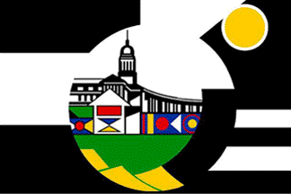
On 5 April 2002 the Tshwane Metropolitan Council adopted a new logo.
The Tshwane Metropolitan Council incorporates the former municipalities of Pretoria, Centurion, Mamelodi, Akasia, Attridgeville and Hammanskraal
and was formed following the re-organisation of local government in
South Africa in December 2000. The flags used by these former municipalities are now no longer in use. The new logo forms the basis
of a municipal flag. The logo has the inscription "City of Tshwane - we are the same" beneath but this has been omitted from the flag.
The symbolism of the new logo and flag as provided by the Metro Council Marketing Office is as follows:
The Union Buildings, shown in the centre of the logo, are an important landmark both in the city and South Africa. They were designed by Sir
Herbert Baker and were completed in 1912 and house the Office of the
President. They are a political symbol that gives expression to the capital status of the City of Tshwane.
The structure below the Union Buildings symbolises the vast array of architectural infrastructure throughout the length and breadth of the
metropolitan area. It also symbolises a commitment to further developing this infrastructure. The geometrical figure superimposed on this
structure celebrates the artistic expression of the people of Tshwane in their endeavours. It is also provides recognition and acknowledgement
of the important role that women play in society.
In isiNdebele customary trad